Pressens hus
| Program | Office |
| Client | Aspelin Ramm |
| Size | 3800m2 gross area |
| Status | Completed. Opened for the public 18th of June 2021 |
| Awards | Oslo city Architecture Award 2022, Oslo Architects Assosiation Architecture award 2022 |
| Collaboration | KIMA |
| Interior architects | IARK |
| Main contractor | HENT |
| Structural engineering | Rambøll |
| Consultants | Rambøll, Multiconsult, Engenius, Brekke & Strand, Fokus rådgivning |
| Photocredit | Einar Aslaksen, Inger Marie Grini, Niklas Hart |
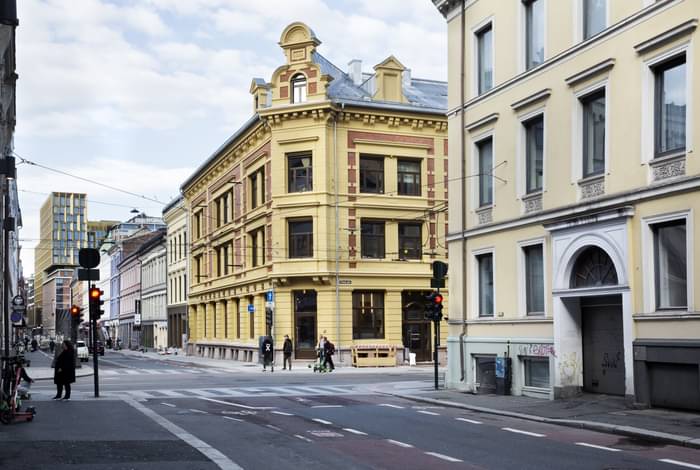
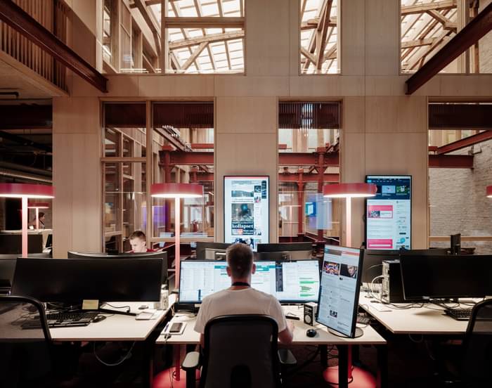
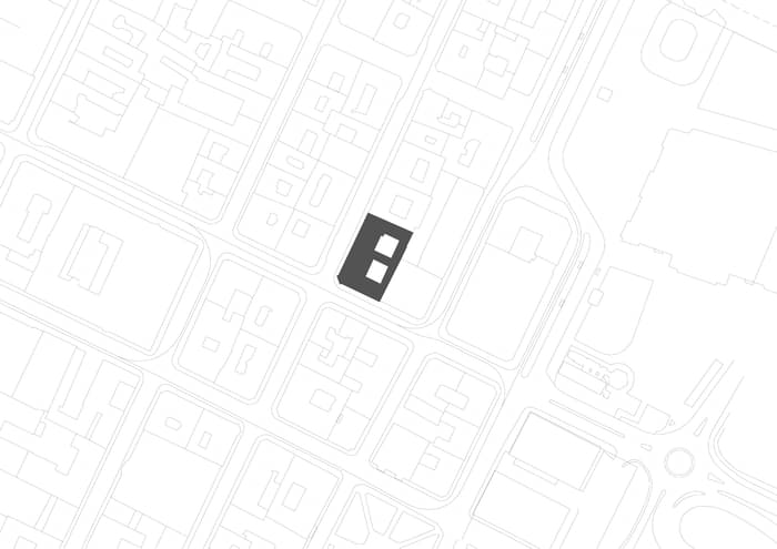
The Norwegian Press House (Pressens hus) is a transformation of two listed buildings from the 1880’s in the historic city center of Oslo. The buildings have been transformed into a new hub for media and press activities, with rooms for conferences, studios, meetings, and a café/restaurant. It also includes offices for 11 prominent media organizations in Norway, with room for approximately 200 people. The design was done in close dialogue with the preservation authorities to find solutions in adherence to the many restrictions due to the listing of both buildings.
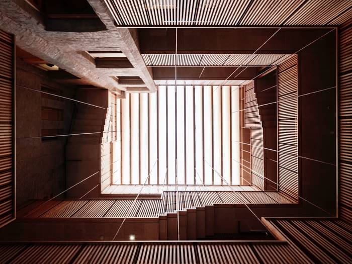
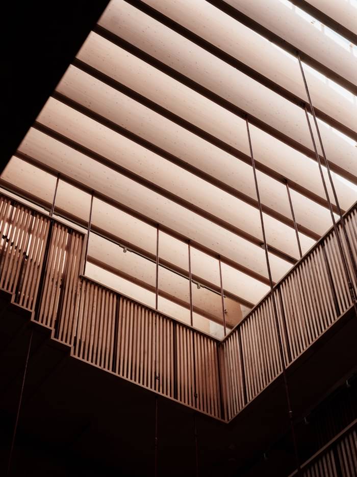
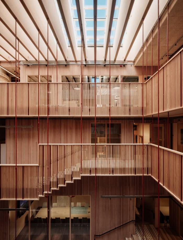
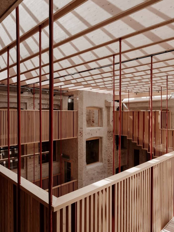
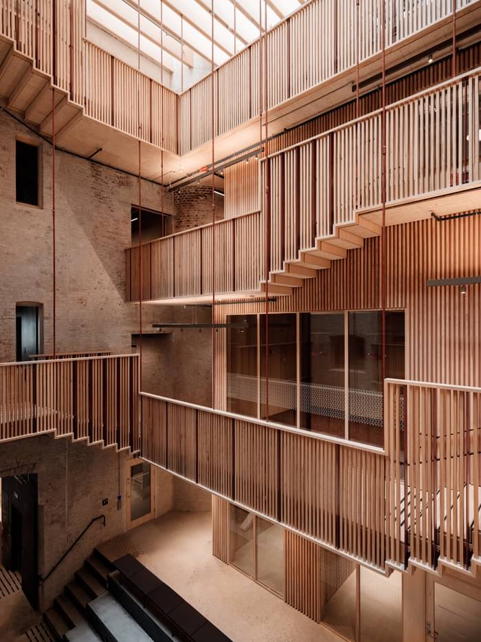
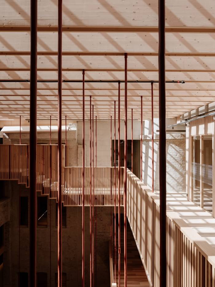
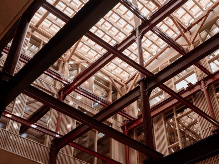
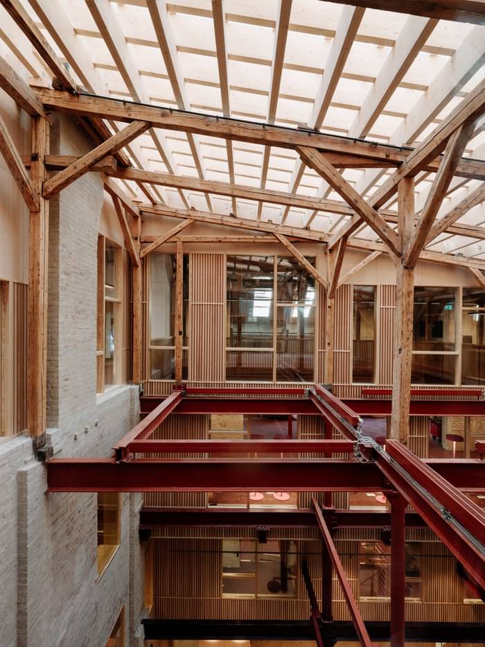
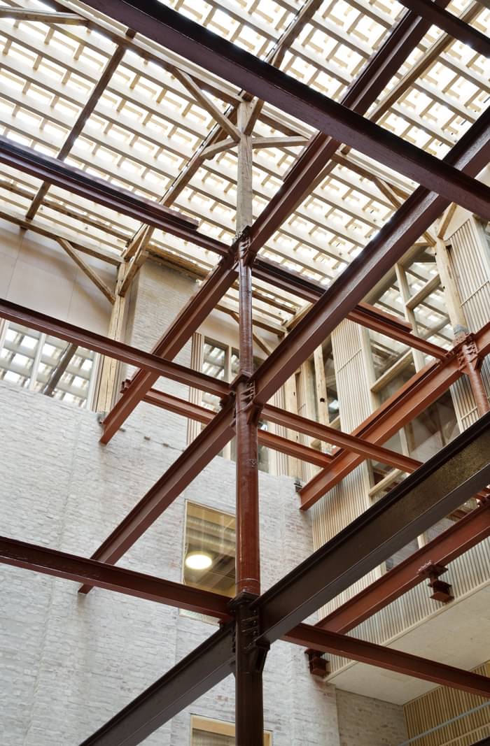
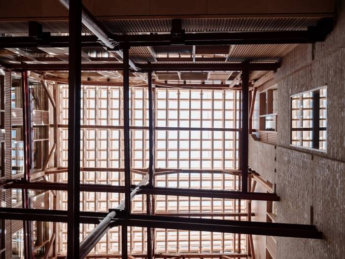
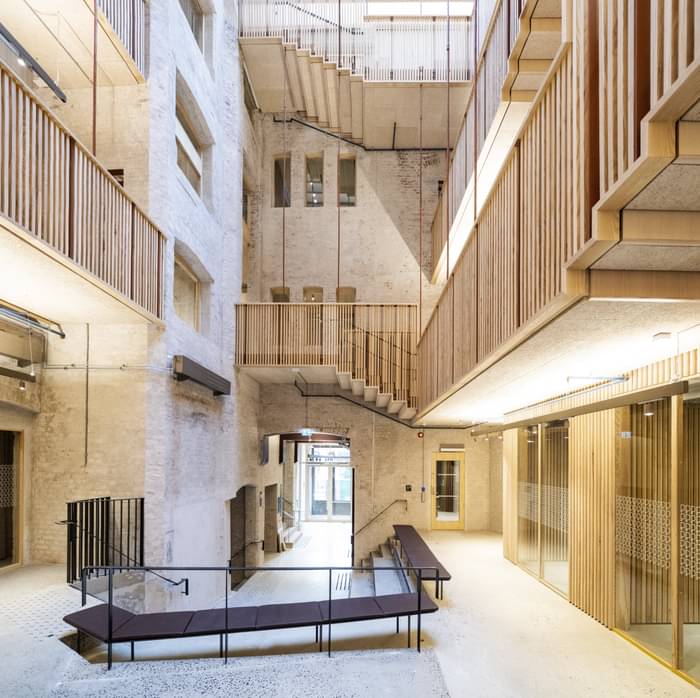
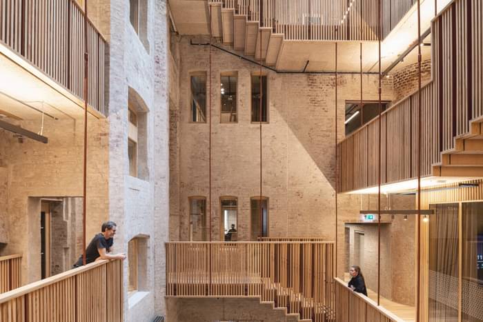
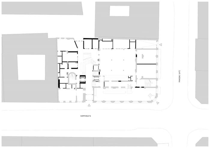
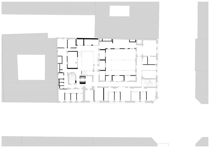
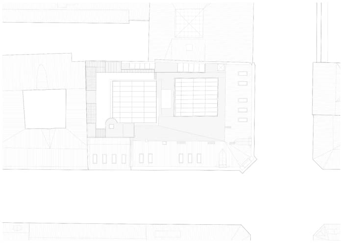
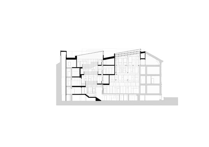
The project is organized around two atriums, surrounded by offices, social zones, circulation, and meeting rooms. The entrance atrium is a transformation of a former courtyard, the auditorium atrium is a transformation of a part that used to function as a warehouse. The two atriums provide light to the rather deep volume and helps visitors to orientate. The entrance atrium grows larger for each rising floor, while the auditorium atrium works in the opposite way. The entrance atrium is surrounded by bridges that are suspended from new beams of laminated timber holding the glass roof. This atrium has a light feeling and forms a contrast to the other atrium, the auditorium atrium, which consists of an old, listed steel structure that is the reminiscence of the old warehouse. Here all the decks were removed to create a space of structure and light. The new glass roof over this atrium appears to grow out of the old structure, creating a layered wood structure that filters the light.
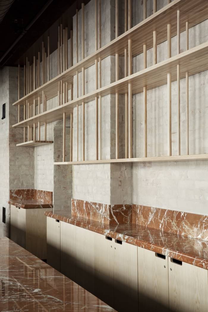
Most of the old brick structure has been kept, restored, and given precise cuts to create rooms for new circulation and technical equipment. Due to different floor levels between the two buildings, it was necessary to establish a completely new internal circulation to achieve universal accessibility. The old brick walls have been carefully plastered with lime to provide a light organic quality throughout the interior. The old (and new) load bearing steel structures have been given colors in red tones to contrast with the light mural walls, but at the same time resonate with the glimpses of the original red brick color.
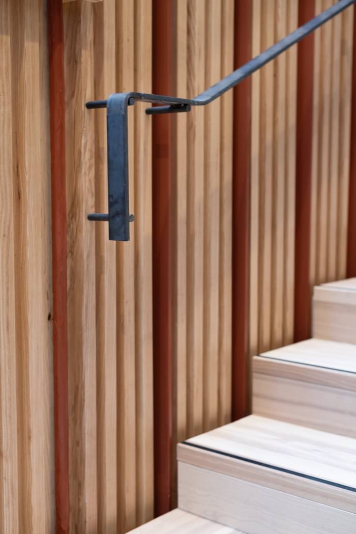
New structures have been built in light ash wood to blend in, but also differ with the original materials. The facades have been restored and returned to their original color and finishing. The ground floor is public with a new café/restaurant facing the street. A new, continuous white concrete floor functions as a new carpet and extension of the city floor outside, welcoming visitors in from the street and into the building.